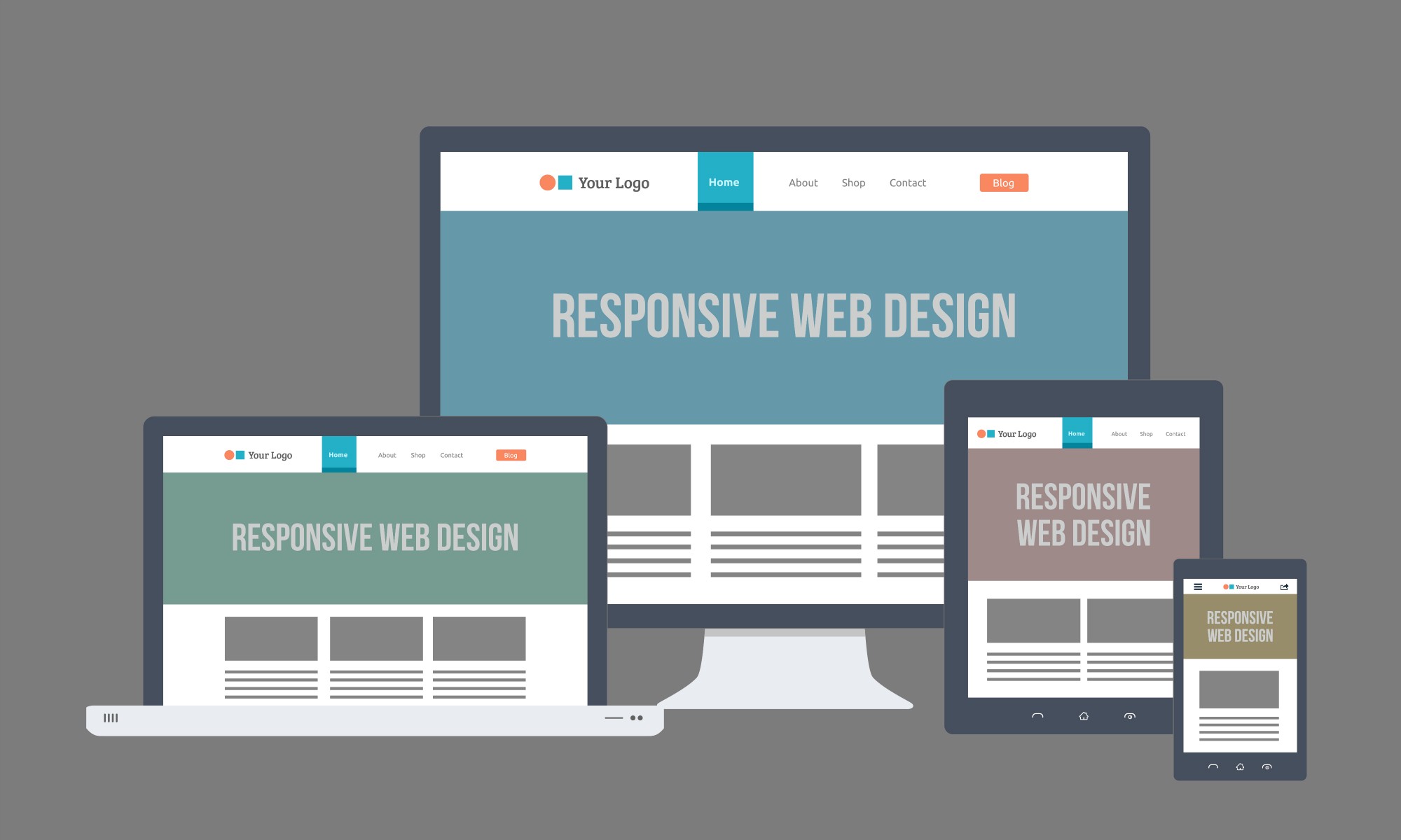
Responsive web design (RWD) is an approach to web design that makes web pages render well on a variety of devices and window or screen sizes. Recent work also considers the viewer proximity as part of the viewing context as an extension for RWD.
Due to the high volume of internet traffic using mobile devices, they can no longer be ignored. In 2014, for the first time more users accessed the internet from their mobile devices than desktop.[23] Where a web site must support basic mobile devices that lack JavaScript, browser ("user agent") detection (also called "browser sniffing") and mobile device detection[20][24] are two ways of deducing if certain HTML and CSS features are supported (as a basis for progressive enhancement)—however, these methods are not completely reliable unless used in conjunction with a device capabilities database. For more capable mobile phones and PCs, JavaScript frameworks like Modernizr, jQuery, and jQuery Mobile that can directly test browser support for HTML/CSS features (or identify the device or user agent) are popular. Polyfills can be used to add support for features—e.g. to support media queries (required for RWD), and enhance HTML5 support, on Internet Explorer. Feature detection also might not be completely reliable; some may report that a feature is available, when it is either missing or so poorly implemented that it is effectively nonfunctional.